This post will cover the topic of social network analysis and visualization. We will describe specific properties of graphs that represent social networks, and different algorithms used to visualize them. In the end, we will take one concrete example of an ego network and use the open-source tool Gephi to discover the network properties and display them graphically.
Unveiling the power of graphs
Graphs are data structures consisting of nodes that represent any type of entity, and edges that represent relations between those nodes. Edges can be undirected or directed and can also have a value or weight. Both can contain any number of additional properties by which they can later be grouped or filtered.
Graphs are ideal for representing different kinds of networks. They can describe mathematical or computer science problems, as well as biological or physical systems, and even linguistics. We’ll dive deeper into how social networks can benefit from being modeled as a graph.
Social network graphs typically represent individuals as nodes and the edges between them can represent various types of social relationships. They require the introduction of some terms in addition to the usual graph theory terms. These often describe properties of individual nodes, mainly their importance within the wider network. This “importance” is measured as centrality.
· Degree centrality of a node is a value representing the number of inbound or outbound edges, also known as indegree or outdegree (just “degree” for undirected graphs).
· Betweenness centrality is how many times a node is on the shortest path between any two other nodes in the graph.
· Closeness centrality of a node represents the average shortest path between a node and any other connected nodes in a graph.
· Eigenvector centrality calculates the sum of the centralities of its neighbors, divided by some constant. A variation of this algorithm, PageRank, is used by Google to rank search results in its systems.
These centralities can help with finding key nodes in the network that often serve as links between separate communities, or clusters.
Clusters are groups of nodes that are, by some measure, well connected to the other nodes in the same cluster, but sparsely connected to the rest of the graph. There are many different algorithms for detecting clusters; they can, for example, simulate the removal of edges with the highest edge betweenness centralities (analogous to node betweenness centrality) until you end up with isolated communities - only intra-group edges remain.
Social network graphs are found to have unique features in terms of clustering and centrality properties. When compared with randomly generated networks, they do not display the same affinities for clustering. In general, social network graphs tend to have a small number of nodes connected to many other nodes (or “central” nodes) and many other groups of nodes with some edges in-between them, but very few connecting them to nodes outside their groups/clusters. Most inter-cluster connections, or shortest paths between nodes from different clusters, will go through the central nodes mentioned above. Clusters, communities, and groups are often used interchangeably when talking about social networks. An interesting concept in social networks is “6 degrees of separation” - or small world phenomena – which proposes that in a social network, all actors will be no more than 6 “hops” distant from each other. This initially referred to the whole population of Earth, where any two persons would be no more than 6 degrees distant. Real-world data of the Twitter follow network shows that their median is only 4.67, meaning that, on average, all users of Twitter are connected with 3 or 4 users being in between them. Meta’s research shows that 3.5 is the average degree of separation of all Facebook users
(https://research.facebook.com/blog/2016/2/three-and-a-half-degrees-of-separation/).
Network visualization
Visualization techniques for graphs are numerous, and a category of force-directed algorithms has emerged as a popular tool for this. These algorithms usually model the graph as a real-world physical system, which is then simulated and rearranged based on preset rules.
Resulting visualizations often give us a quick insight into underlying network properties that would otherwise be more difficult to grasp without detailed statistical analysis.
Edges can be manipulated to create a “bundling” effect if there are too many of them overlapping, and if they follow a common path through the graph. Inter-cluster edges can be merged into a single edge and their width may be used to indicate a number of previously separate edges.
Node color can be used to represent different clusters. Nodes from different clusters can also be physically divided in different ways to better show relations in a group and broader cluster-to-cluster connections.
One of the more popular applications for graph visualization is Gephi, an open-source project written in Java and available on multiple platforms. There are several formats for saving graph files, with graphml probably being the most portable choice.
Visualization demo
Let’s visualize a concrete ego network – a network from the perspective of a single user/ego with all its 1st-degree connections, as well as any connections between those nodes.
1. Obtain a graphml file or a similar supported format. For example, you can download the Facebook network dataset from the Stanford site: https://snap.stanford.edu/data/facebook_combined.txt.gz. The text file has been slightly modified by replacing the space separator with a comma so that it can be loaded as a CSV file. This format is simple, consisting of only a list of edges. More detailed information is available at: https://snap.stanford.edu/data/ego-Facebook.html.
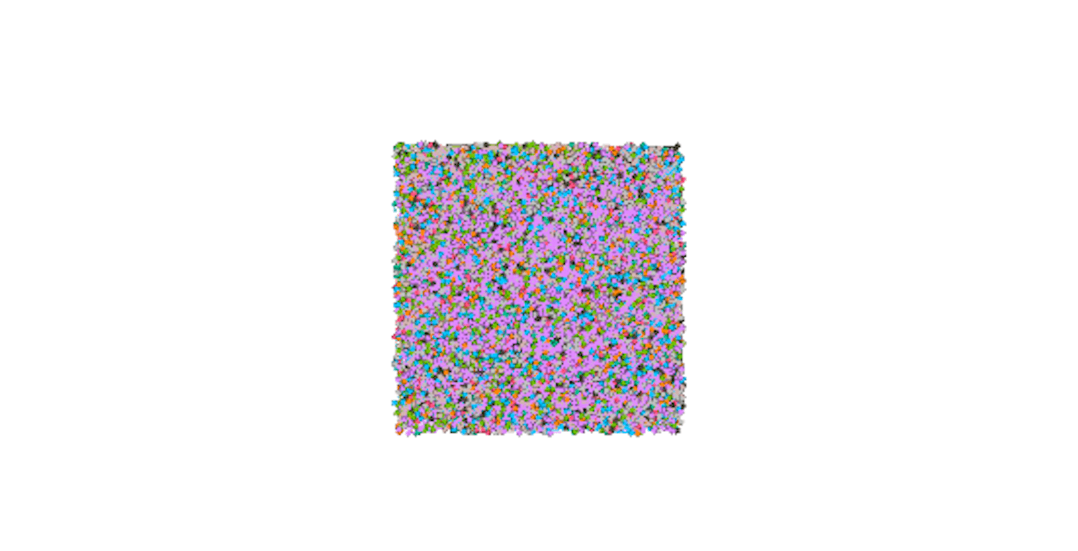
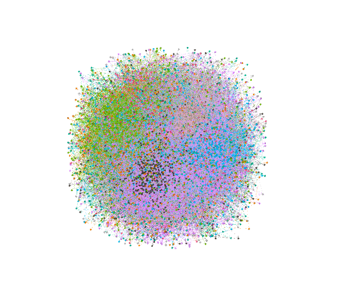
2. Open the file in Gephi. The visualization obtained initially may not be particularly useful, so we will need to perform some transformations first.

3. Use the clustering algorithm to assign nodes to clusters. Gephi has a few different ways to detect clusters, but here we can calculate “modularity” (a very similar concept) in the Community Detection section. It will display some statistics that it calculated for the network.
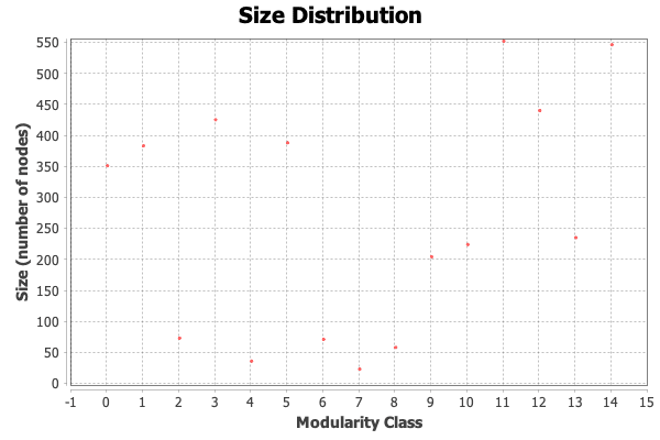
The size distribution graph shows us that 15 different communities/modules were detected, with their size ranging from a few to a few hundred members.
4. Under nodes->partition, choose vertex color property by modularity class. After running step 3, each node will be extended with a “modularity class” property value that assigns a node to a single cluster. Nodes with the same values will be represented by the same color.
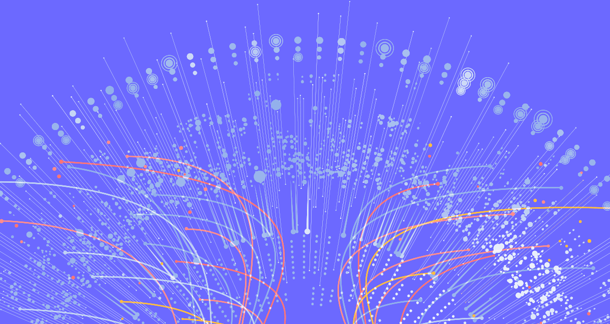
5. Now, we need to simulate one of the force-directed algorithms to get something readable out of the image above. In this case, the Fruchterman-Reingold algorithm was used, and the speed was increased to 10 (from the default value of 1) to reach the results faster. This algorithm models nodes as electrified particles that repulse each other and edges as elastic wires that pull nodes back together. A concept of “gravity” was also added to prevent nodes from wandering too far from the center of the graph. This algorithm may be slower than some newer ones, but its progression is easier to follow and it was a base for many later optimizations.
If the network gets too large, ForceAtlas and OpenOrd algorithms are better options to get good results after a short simulation.
Screenshots below display the progress of the algorithm as it simulates node movement.
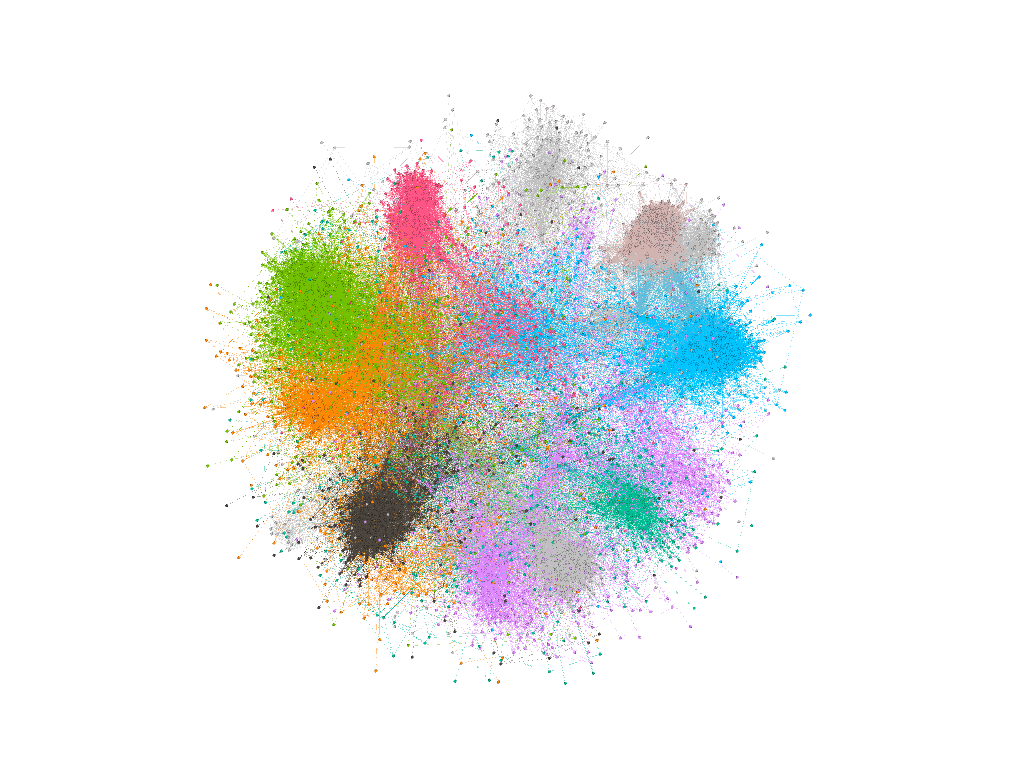
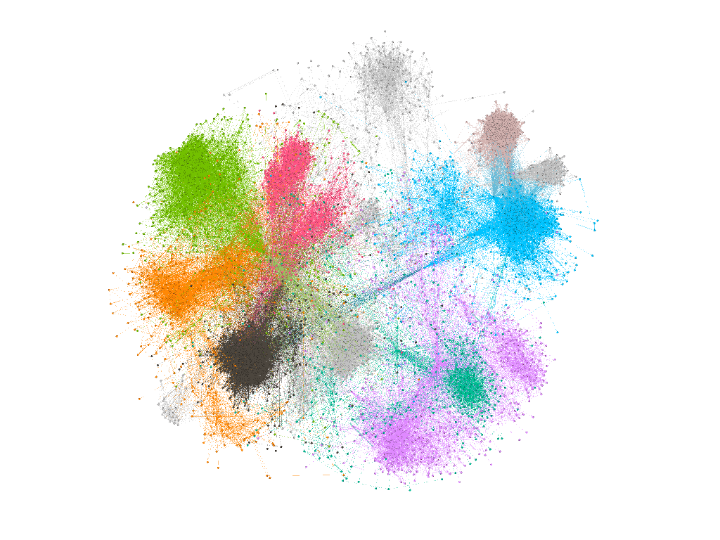
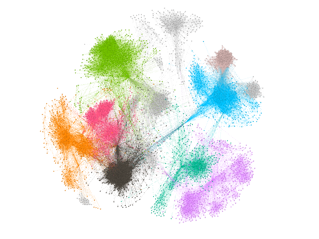
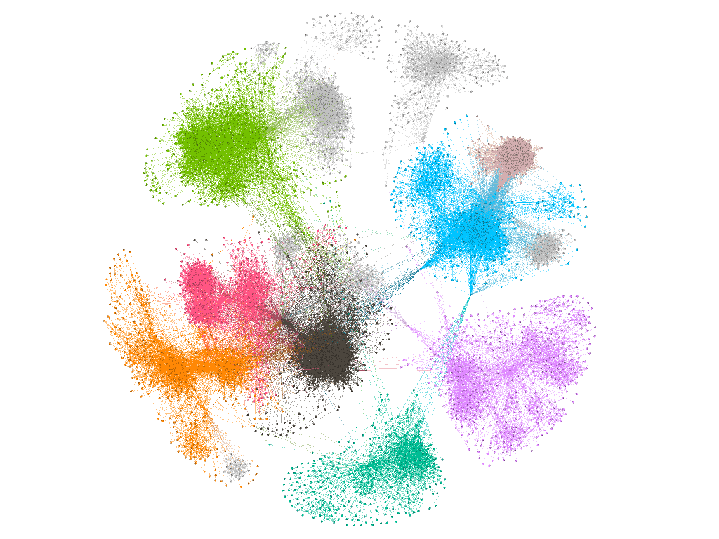
The resulting graph above conveniently reveals that the differently-colored clusters, which we identified in the initial steps, naturally form after running a force-directed algorithm. This implies that many network features can be concluded just from the visual analysis of the well-laid-out graph, without going into the statistical details of the underlying data.
If the resulting image looks suboptimal, Gephi gives you an option to manually move “stuck” nodes and continue the simulation.
Here are some additional visualization options:
If the resulting image appears suboptimal, Gephi gives you an option to manually move “stuck” nodes and continue the simulation
You can use edge width to represent its weight
Vertex size can also represent its total degree, so larger nodes can be easily detected as the ones with the most edges
Any node property can be set as a vertex label, which can especially be useful in this case because of the extended data set that contains much more metadata than just the node adjacency matrix
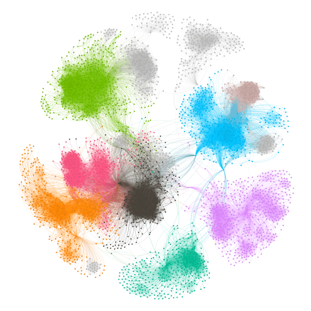
The “Preview” tab in Gephi is better suited for static images after the simulation is complete, and edges in this mode can be drawn as Bezier curves that often produce nicer results than just straight edges
Here is the final static image of the graph using the “Preview” feature - note the Bezier curves instead of the straight edges:
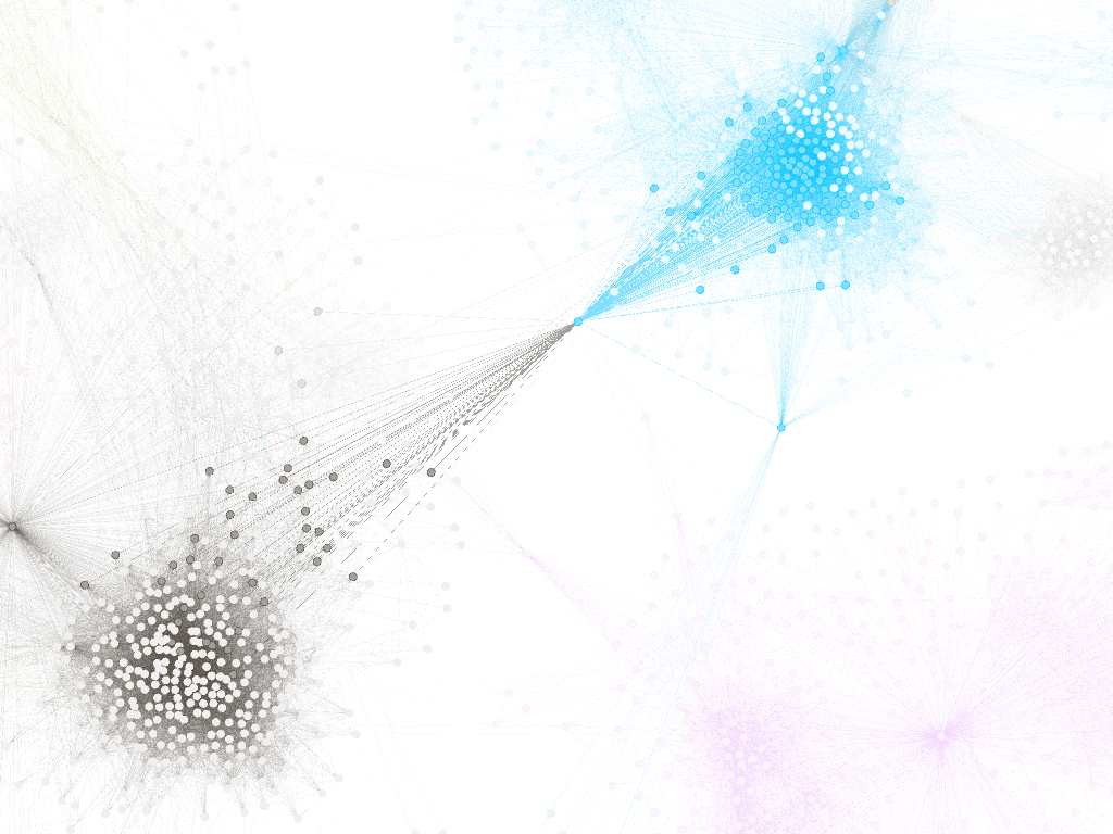
We can zoom in on a portion of the network to better observe its properties. In the example below, a central node that connects separate communities is highlighted to showcase its highly-connected nature. In certain contexts, this node would be singled out as an "influencer".
Since the network that was analyzed was a Facebook ego network, communities that were identified in the above visualization represent different groups of family, friends, schoolmates, or other acquaintances of the central individual.
In the context of the Twitter networks, communities could be grouped in some different ways, for example centering around fan communities or political tendencies. LinkedIn's ego network, on the other hand, could show clusters of individuals from different industries or regions.
In the past, retrieving the data necessary for network analysis was generally easier, even from big services like Facebook and Twitter. Due to the value of this data and its applications, but also because of the numerous security scandals that revolved around leaks or misuses, social network services give only basic API access and don’t allow retrieving data in bulk, and beyond 1st-degree contacts. You can usually still scan your own networks, but for more extensive analysis, some data scraping would need to be included.
This demonstration has hopefully given you a glimpse into the process of visualizing social networks and characterizing them without prior expertise in this domain. The Gephi exercise showed how this tool can be used to quickly get basic results, while also having an option for more advanced statistical analysis. The next step would be to do an in-depth look into these visual representations to make conclusions about the data, which goes beyond the mostly technical standpoint of this post.
About the author
Luka Potkonjak is a Software Engineer working in the engineering hub in Belgrade. He mainly focuses on backend development, using Java, .NET, and C++. Besides being a Backend Engineer, he was a Team Lead in Symphony and is interested in software architecture. Luka spent a considerable part of his career working on Microsoft Azure - one of the biggest data center networks in the world.